When this blog was born, I choose to call it by my name.
But I am getting ahead of myself. I will try and keep this short.
No promises.
My name at birth was Jennifer Chase Kimball.
My mom named me Jennifer so she could call me Jenny.
She loves Jenny. (Though throughout my childhood occasionally lamented that she should have named me Elizabeth and called me Lisa- she loves Lisa too.)
What's done is done: Jenny Kimball I was.
When I got my first real job out of college at an interior design firm in San Francisco, I took the opportunity to change it up a bit and went by Jennifer. Jenny Kimball always reminded me of myself, in pigtails and glasses, age 5. Jennifer Kimball had a better rhythm to it. I brought it with me when I moved to Chicago two years later and started working for another design firm- being from the area though, there was a bit of confusion about the Jenny/Jennifer thing.
Then I got married and took my husbands name, and became Jennifer Kimball Brown. Or Jennifer Brown, professionally.
I was never wild about this, it doesn't have the right ring to it- or to me, at least.
So when I started my own design firm, after much back and forth incorporating my maiden name, my initials, and one spirited suggestion of "JKB Solution Designz", I opted for, simply: Jenny Brown. When this .com was taken, I went for jennybrowndesigns.com (did not want to limit myself to 'interiors'). BTW- I am working on the website. It's on the list...
But Romeo, Romeo, what is in a name?
And how would it look on paper?
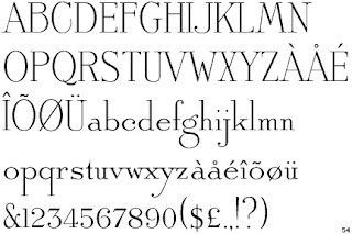
I knew I wanted the Antique Roman Font:
Available here. (Surely you are in the market for a new font)
A traditional font used on our wedding invitation, my parents' wedding invitation, and Pierce's birth announcement.
A friend had used the Ecru/pink version for both of her daughters and I knew I would use it too, long before I ever had a child. Available here.
I use this font for all of my business correspondences- except now that I am using this fantastic software for designers, my paperwork is looking very generic. Add that to the list, too.
For the blog, I decided to have fun with it and add color- my own little twist to knock back the formality of the font. And hey, it worked for them:
If Mikey likes it, it must be good:
He really likes it!
And let's just throw in these fearlessly colorful logos for good measure:
In conclusion, you can imagine my amusement when I went to our family storage locker today and found this folder I decorated in 2nd grade:
At least I'm consistent.
Xox,
Jenny


No comments:
Post a Comment